Torch Innovation Precinct at UNSW
The UNSW International in partnership with the Torch Innovation precinct site was created to foster collaboration between China and Australia for Australia’s University of New South Wales.With efforts to raise funding for the Torch Innovation Precinct increasing, the Torch project required a digital information hub to act as a showcase vehicle to highlight Torch to prospective investors.
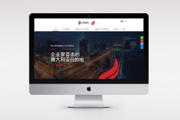
The brief to Adrenalin was to design and develop a platform which would speak to both Australian and Chinese industry and resonate with the spirit of Torch by adopting an entrepreneurial flair. Key requirements centered around usability, persuasive architecture and differentiation. A bilingual approach was essential to reach both the English and Chinese speaking audiences.
CLIENT
UNSW International
AGENCY
Adrenalin
ROLE
UX, Visual Design
The solution
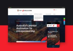
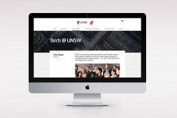
The Torch website is an engaging hub for information. The sleek, responsive, bilingual site successfully represents the pioneering Sino-Australian venture.
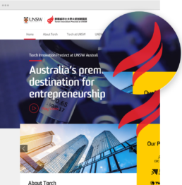
The site showcases a full width video hero on the homepage and an animated SVG of the torch logo to cement the brand presence. Subtle transitions such as animated lines and zoomed in imagery on hover help to guide the user through the site.
A strong use of the colour red is featured throughout the site as the main brand colour for the Torch organisation, and yellow to represent the collaboration with UNSW. Content is displayed predominantly on tiles for easy segregation.
Part of the brief to Adrenalin was to establish the branding for the project. The animation and prominent positioning of the easily recognisable Torch Flame logo enables the user to quickly identify with and understand the project. Subtle cues to the branding and integration of animated brand devices throughout the platform reinforce the project’s credibility.


