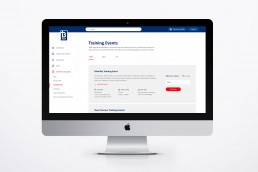
BPAY Training Portal
BPAY wanted a human-centred approach to redesigning their internal training portal for all national staff. The portal needed to be easy to use for all staff no matter what department they worked in.
The BPAY portal was a part of a larger digital transformation project for the BPAY business, including their main site, BPAY Banter news & insights platform as well as digital communications.
Understanding the problem
Staff were to use the portal to download training material and view videos on specific modules relating to BPAY services. They could also view upcoming training related events in their region and register to attend online.
CLIENT
BPAY
ROLE
Lead Product Designer
RESPONSIBILITIES
UX / Wireframing
Ideation & Prototyping
Workshop Facilitation
Product Design
UX / Wireframes
Low fidelity wireframes were created to ensure usability was optimal for all departments in the business including product management, operations and sales.
The solution
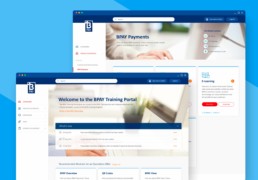
The solution was a portal that was clean, utilising existing BPAY brand colours and typography.
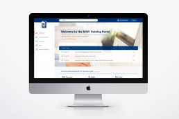
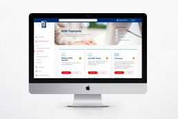
Information was clearly divided between departments in a left hand fixed navigation with supporting iconography to aid the user. A card approach was used to showcase modules making it very easy for the user to navigate clearly through the information. New events and modules that had been added were showcased on the homepage in an accordian style table easy for the user to dismiss if irrelevant.
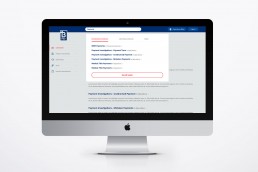
Another feature of the portal was an intuitive search that split up recommended modules from additional modules making it easier for the user to find the most relevant information.
Staff were also able to view and register for events in their state.
